We were particularly interested in the title sequences to thriller film openings because this is the film genre that we have chosen for our own media product.
Se7en (1995)
The props (mise-en-scéne) used in the opening sequence to Se7en are symbolic of its key themes, including violence, apathy and hopelessness. The montage editing gives the audience a look into the mind of a serial killer. The face of the character is not shown, however the dark tone and low-key lighting of the opening suggests that they are the antagonist. The opening features close-up photography of personal items, therefore the opening is symbolises the antagonist's character traits.
The opening sequence is influential because we are considering incorporating props into our media product symbolic and foretelling of its the key themes. For example, a weapon can be used as a prop to symbolise violence. Furthermore, we are considering using extreme close-ups because such shots are intense and draw the audience's attention.

The Girl with the Dragon Tattoo (2011)
The opening sequence to The Girl with the Dragon Tattoo is suggestive of the film's dark and sadistic tone: viscid, black ooze covers the screen which creates a suspenseful atmosphere. The mise-en-scéne and extreme close-ups of violent graphics are as much mystifying as they are disturbing. Therefore, the thriller genre of the film is suggested explicitly. The editing is fast-paced; jump shots and exaggerated diegetic/non-diegetic sounds startle the audience, which reinforces the thriller genre. The opening sequence appeals to its target audience because it is explosive and exciting. The oozing ink which suffocates people in the opening suggests death and violence as connotations of the film.
The titles and typography of The Girl with the Dragon Tattoo are inspirational: the whiteness of the logo juxtaposes the black background. Therefore, we are considering producing our opening sequence so that it is dark and dimly-lit to construct a thrilling atmosphere. It is highly likely that our titles will also be simple and bold to ensure that they standout without necessarily distracting the audience from the onscreen action.
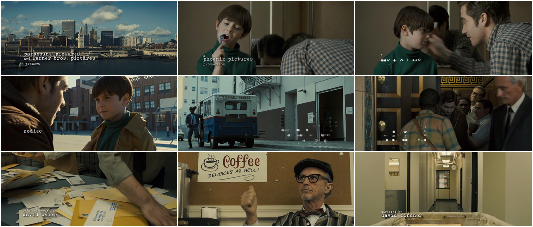
 Zodiac (2007)
 In Zodiac, the initial establishing shot sets the scene of San Francisco. The opening sequence is primarily narrative, so its titles lack signifance. The realistic narrative of a man going to work and dropping his child to school suggests emotional realism. For example, although the medium close-up shot of the boy brushing his teeth is unthrilling, it adds an element of social realism to the opening.
The opening sequence to Zodiac is influential because we are considering whether the narrative of our media product should revolve around the morning routines of our antagonist and/or protagonist. The inclusion of trivial everyday things into our opening sequence could construct verisimilitude. However, making the ordinary seems extraordinary will be exciting for the audience. For example, in our storyboard, we have planned to include a scene in which one half of the split-screen effect shows the protagonist flossing in front of a mirror, whereas the other half shows the antagonist bending wire (a prop) in front of the mirror.
No comments:
Post a Comment